
Untangling the knots
The most important thing in a relationship is communication. This app is designed to help couples interact in an effective and seamless manner. Be it a small favor for your loved one or a major issue you are trying to avoid, we are here to assist you!

My Role
This project was carried in two phases - exploration and implementation. For the first phase, I teamed up with three other designers in order to reach out to a more diverse audience and to be able to go in-depth with the research.
For the second phase, we were asked to work on our own and come with our own solutions to the problems that evolved from our research.
The Challenge
Make Relationships more Durable
The theme of the project was to design for "love in the digital age". We decided to break it into three parts based on a standard person's journey in a relationship - "finding love", "maintaining love" and "getting over love".
Based on our team's personal empathy level with the concepts, we decided to go forward with "maintaining love". The initial idea was to design for a couple to make relationships more durable!
How might we encourage long-distance couples to get more involved in each other's life?
Kick off
What do we know?
At the outset of the project, we didn't have a clear idea of what it takes to maintain a relationship. Without pre-existing insights, we used our own experiences and quick online research to create a hypothesis board (Language of Love).


What do "you" expect?
From our research hypothesis, we prepared a script for our interviews. Amongst the four of us, we interviewed a total of 18 people. To reach out to a more diverse community we used gorilla interviews, scheduled face to face meetings and in some cases also did online audio and video calls.
We interviewed people with live-in to long-distance relationships, from less than a month old to more than 20 years old and problematic to smooth sailing relationships. This gave a board sample set to validate our hypothesis.


The Discovery
Sense MakinG
To get the analysis phase off the ground we began with speed story sharing. It helped us get a quick understanding of all the characters we interviewed. With the stories fresh in our head, we moved to our post-it wall!
The clustering phase took us 3 iterations which were full of swapping and reclustering the qualitative bits. With each phase, our affinity diagram became richer with content and the themes started making sense. Finally, once we were content with overarching themes, we extracted insights, issues, and opportunities from each of them.


Phase 1
.jpg)

Phase 2


Phase 3
Extracting insights
After a good understanding of our user's thoughts on long-distance relationships, we were able to extract deeper and meaningful insights. Some of the key and actionable insight were:
Sometimes you need to give them their space.
Quality time is important to keep it interesting.
Not every argument or disagreement is a fight.
Letters are considered personal and still cherished.
If you keep piling issues, the blow-up can be worse.
There should be a balance in the effort from both partners.
Reflection
Who and Why
Once we were comfortable with the primary research, we created a list of items that would determine our users' behaviors during a relationship. Using that as a reference legend, we created personas, journey maps, empathy maps, and user scenarios. Being a team of four, each of us took charge of a character. My character was an international student Kevin, who recently started a long-distance relationship with his high school sweetheart! Later on, he also became the primary persona for my solution.


Kevin's Backstory
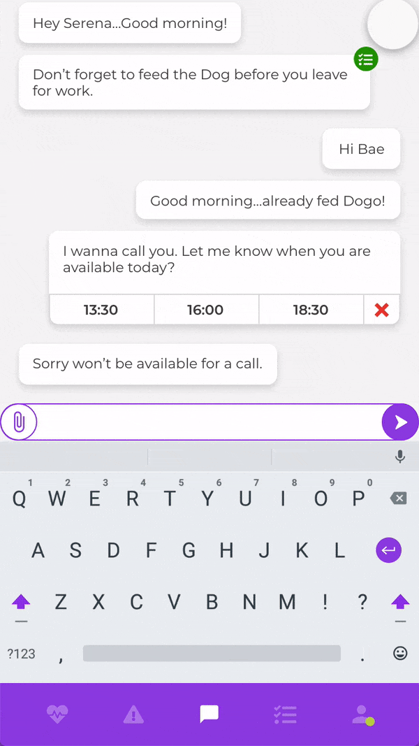
"I feel guilty to enjoy new experiences without Serena so I try to share my new life with her. I am not very good at expressing myself with texts so I prefer sending voice messages, videos, and pictures.
I really need to succeed in my studies because I have a loan, so sometimes it becomes difficult for me to find time in my schedule to call Serena. I have a hard time remembering her schedule, so I often forget when she is free to talk. This often leads to a lot of misunderstandings and fights.
There is a 4 hour time difference between Cleveland (Ohio) and Paris, so if I want to talk to her, I have to call her around 11:00 PM. I have to go to bed late just to make sure I can talk to her. Since I am the one who left, there is a lot of pressure on me to go home during the holidays to see her. Obviously, we do not discuss trivial issues and I don’t want Serena to worry so I can also not be completely honest with her. It seems hard work but I think in the end it will be worth it: when you put a lot of work into something, you care more for it."

The other 3 team members made a similar set of documents for their characters as well. Later on in the project, I chose 2 of them to be my secondary personas and one of them (John), became a negative persona for me. For your reference, the personas are shown below:


Conceptual Funnel
Design Opportunities
This is where the project became an individual one - we were asked to use the same research and come up with our own solutions. Initially, I brainstormed ideas for all four personas but soon Kevin became my primary persona. I translated the initial "how might we" into design opportunities:
Sync the relationship by finding moments of mutual convenience.
Record issues to be discussed later at more appropriate moments.
A combined to-do list that keeps track of your couple's needs and goals.
Analyze texts to convey emotionally richer feedback of the partner's mental state.
Appreciate each other and celebrate one's effort in the relationship.
Adapt to the changing lifestyle of your partner and be more supportive.
Great idea, but...
With some quick wireframes of my concepts, I went out to my potential users and asked for their feedback. While some of it was supportive, a lot of it was eye-opening and inspiring. The best sessions were the ones that had co-creation: the interviewees were given a chance to draw their recommendations!
.jpg)

.jpg)
"I don't think an app should tell me and my partner how much effort we need to put in our relationship. It seems very judgy" - Kate
"Storing issues might backfire if there is a big pile of unresolved bits. Sometimes you just forget small thing" - Jonah
"I think a lot of fights with my boyfriend are misdirected anger. I might be stressed about work and give out to him for the dishes" - Erin
"I don't want him to keep asking me to do something again and again. It is embarrassing and annoying" - Claire
Boil down and Reframe
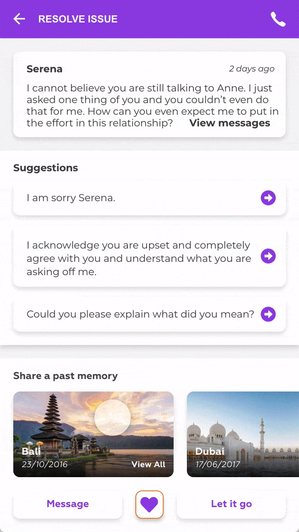
I went back to the post-it wall and analyzed the feedback with the initial research. It was at this stage, that I gained insight: for a successful relationship the most important thing is quality communication. I decided to narrow down the functionalities of my app and reframed my app's vision towards effective communication and issue resolving.
Experimenting
Quick And Easy
Once I had an idea of what my product is focused on, I started with rapid prototyping and talking to people. My general strategy is to do most of the ideation at the lo-fi stage as it's quick and very easy for the user to collaborate. I got a bunch of feedback that improved my designs and even gave me the conceptual ideas that I used in my final designs!


"I hate it when my partner interrupts me while I am venting. It makes me...even more furious" - Laura
"I love the avatar feature. It makes me feel like I am talking to my girlfriend" - Marcus
"I think answer suggestions should not be encouraged as they may backfire. A sorry is more frustrating if you don't mean it" - Lucy
"What if we don't reach a conclusion? The app should have a storm off feature" - Keith
Fake it till you make it
I was really excited by the feedback I got from Laura and used it to create a new feature in the app called "pass the ball". The idea was to let one user finish speaking before the other person could start speaking and so on. I hoped this would ensure no branching while resolving issues and could help argue in a streamlined fashion.
But since it was not a standard practice in typical communication platforms, I decided to test it before jumping into high hi-fi screens. So I did experience prototyping where I requested a friend couple to resolve an issue in a similar fashion over WhatsApp. As expected they were able to reach an agreement and the concept was proven effective!


Final Frontier
Taking the leap
After doing 3 rounds of lo-fi testing and a bit of experience prototyping, my concept was ready to go into the high fidelity stage. I jumped into XD (also my first experience with the software) and began prototyping. Some of the hi-fi screens are shown below:

Peer Review
With the first version of hi-fi prototypes done, my class students divided into groups of 4, had a session of feedback amongst ourselves. It was very different from user interviews as we knew each other's concepts and design practices as well. Some of the feedback I got was valuable and helped me create more impact through the UI elements.
.jpg)

Heuristics Evaluation
After the peer review, I did a heuristic evaluation of the main screen to critically analyze the designs and find any loopholes.

Usability testing
After peer review, I created a prototype from my interface screens and took it out to the users for testing. The purpose was to see if they are able to complete the set off task I gave them and if not, what were the pain points?
Out of the three tasks, all 5 of my users were able to complete 2 of them. The last task was done by 3 of them. My take on the problem was the icon perception: I used a "brain" icon to represent emotional text analysis. The gap in perception was filled once I changed it to a heart icon!


Final User Interface
Based on the feedback from peer review, heuristic evaluation, and usability testing, I simplified the task flows and went tweaked my interfaces. Here is the interface of the important task flows of the product:


Mico Interactions
Finally, I did some exploration with micro-interactions in XD to wrap up the hi-fidelity phase and the project!

Outcome
In the end, I prepared a presentation and pitched the final product to my instructors and fellow classmates. My feedback was very positive - they were especially impressed by the novelty of the concept and the amount of user feedback I took at different stages of the process. As a result, I secured a grade "A" in the course.
.jpg)